Make your Shopify store look consistent, polished, and easy to shop.
Learn how to prepare product images for Shopify product pages, collection grids, mobile storefronts, hero sections, and catalog updates.


Shopify photo basics
What Shopify product photos need to do
Shopify product photos need to work across more than one place: product pages, collection grids, homepage sections, mobile screens, ads, and email.
Shopify images are storefront assets
On Shopify, a product image is not used in just one place. The same image can appear on a product page, collection grid, search result, homepage block, cart drawer, recommendation section, and mobile storefront.
A strong Shopify image should be
- Clear at thumbnail size
- Sharp on product pages
- Consistent with the catalog
- Cropped well for mobile
- Branded enough for your store
- Fast enough to load smoothly
- Accurate to the actual product
Marketplace photo vs. Shopify storefront photo
Marketplace photo
- Often strict white-background expectation
- Built around search results and compliance
- Main image should be simple and direct
Shopify photo
- More flexible brand presentation
- Must work across theme sections
- Can include product-only, lifestyle, transparent, and hero versions
Think in image sets
For Shopify, do not prepare just one image. Prepare a small image set: clean product image, secondary angle, lifestyle image, transparent cutout, and optional hero image.
Build a useful product media set
A Shopify product page can use images, videos, and other media to help buyers understand the product.
Product pages need more than a main photo
A clear main product image helps buyers recognize the item. Secondary images help them understand details, size, texture, use, packaging, and variants.
Useful product media can show
- Front view
- Side or angle view
- Packaging
- Texture or material
- Scale
- Lifestyle use
- Variant differences
- What is included
Build a simple Shopify product image set
Start with a clean product-only image.
This is the most reusable image across your store.
Add one detail image.
Show texture, label, packaging, material, or finish.
Add one scale or context image.
Help buyers understand size or use.
Add one lifestyle image.
Show the product in a real or branded setting.
Keep the set visually consistent.
Similar crops, lighting, and colors make the store feel more professional.
RenderLift tip
Use Marketplace Ready for a clean product-only image, Luxury Studio or Luxury Scene for branded storefront visuals, and Transparent for design assets.
Make collection grids feel consistent
Collection pages look more professional when product images share similar crops, backgrounds, and lighting.
Your collection grid is the first catalog impression
Shopify shoppers often browse collection pages before product pages. If every product image has a different crop, background, and scale, the store can feel unfinished even when the products are good.
Inconsistent grid vs. consistent grid
Inconsistent
- Different product sizes
- Mixed backgrounds
- Uneven lighting
- Random angles
- Some products feel cheap or out of place
Consistent
- Similar framing
- Similar background style
- Even lighting
- Products fill the frame similarly
- Catalog feels intentional
Common grid problems

Mixed background styles
Some products are on white, others on counters, fabric, wood, or colored surfaces.
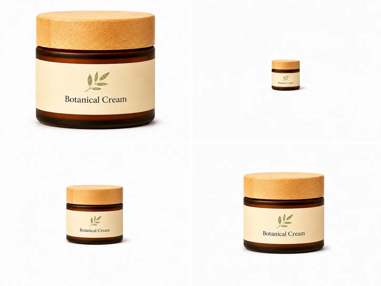
Uneven product scale
One product fills the tile while another looks tiny.
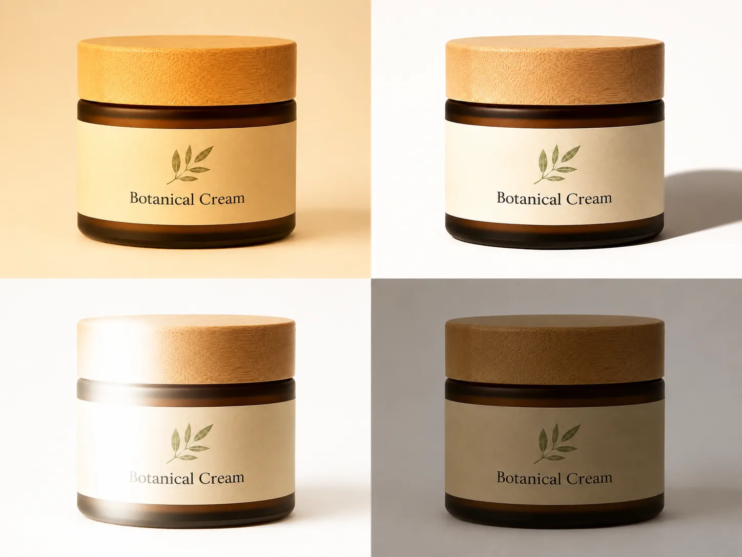
Inconsistent lighting
Products from the same catalog feel like they came from different stores.
RenderLift tip
Use Bulk when you want a group of product photos to follow one approved reference look.
Check how product photos look on mobile
Shopify storefronts are often viewed on phones, so product images need to remain clear in smaller mobile layouts.
Mobile shoppers see smaller images first
A product image that looks acceptable on desktop can become hard to understand on mobile if the product is too small, too wide, or cropped awkwardly.
Mobile image check
View the collection grid on a phone.
Make sure the product is recognizable without zooming.
Check the product page gallery.
Swipe through the images and make sure important details are not cut off.
Watch the top and bottom margins.
Tall products, jars, bottles, and boxes can crop awkwardly depending on the theme.
Keep similar products consistent.
Similar products should occupy a similar amount of space in mobile tiles.
Do not judge only from desktop
Shopify themes can display product images differently across screen sizes. Always check desktop and mobile before publishing a new catalog set.
Balance image quality and store speed
Shopify product images should be high enough quality to look professional, but not so oversized that they slow down the storefront workflow.
Bigger is not always better
High-resolution images look more polished, but uploading unnecessarily huge files can make media management slower and may not improve the buyer experience.
Shopify image guidance to know
- Product and collection images can be up to 5000 × 5000 px or 25 MP.
- Product and collection images must be under 20 MB.
- Shopify says 2048 × 2048 px usually displays best for square product images.
- Shopify can automatically deliver optimized image formats when rendering images through its image system.
- Clean source quality still matters.
Do / don’t
Do
- Export clean, sharp product images.
- Use consistent dimensions for similar catalog images.
- Keep square images around 2048 × 2048 px when that fits your theme.
- Test how images look in your actual theme.
Don't
- Upload blurry screenshots.
- Stretch a tiny image to a large size.
- Use huge files when a clean optimized export is enough.
- Mix many aspect ratios without checking collection grids.
RenderLift tip
Choose the output size based on how the image will be used. Use clean square product images for catalog tiles, larger polished images for hero use, and transparent images for design placements.
Use lifestyle and hero images where they help the store
Shopify gives sellers more room for branded visuals than strict marketplace listings.
Shopify is not only product pages
Your store can use product images in homepage heroes, collection banners, feature blocks, email graphics, ads, and social posts. These images can be more branded than a simple product-only listing image.
Product-only vs. lifestyle vs. hero image
Product-only
- Best for product pages
- Good for collection grids
- Clear and reusable
Lifestyle
- Shows context or use
- Good for secondary images
- Helps tell the brand story
Hero
- Wider composition
- Good for homepage or banners
- Needs extra space for text or design
How to choose the right image type
Use product-only for clarity.
Start with a clean image that shows exactly what is being sold.
Use lifestyle for context.
Show the product in use or in a branded scene.
Use hero images for campaigns.
Leave space for headlines, buttons, or store design elements.
Keep the product truthful.
Branded scenes should still represent the actual product accurately.
RenderLift tip
Use Luxury Studio for premium clean brand visuals, Luxury Scene for lifestyle-style context, and Transparent when the product needs to be placed into a custom design.
How to use a white background correctly
A white background keeps the product easy to scan and is the safest choice for many marketplace main images.
White background does not mean "close enough"
A photo taken against a white wall or lightbox can still look gray, blue, yellow, or uneven. For marketplace main images, the safest approach is a truly clean white background.
Common white background problems

Gray background
Usually caused by underexposure or shadows.

Yellow background
Usually caused by warm indoor lighting.

Uneven background
Usually caused by wrinkles, texture, or mixed light.

Clean white background
Best for clear marketplace presentation.
How to prepare a white-background product photo
Start with the clearest product photo you have.
A better source photo gives the enhancement process more detail to preserve.
Remove or clean up the background.
Make the product the focus. Avoid texture, table edges, wrinkles, and room clutter.
Check the product edge.
Look for rough cutouts, missing parts, halos, or strange shadows.
Review before publishing.
Zoom in and make sure labels, packaging, and shape still look faithful to the original product.
RenderLift tip
Use Marketplace Ready when you want a cleaned-up listing image. Use Transparent when you need a cutout for design work, ads, or non-main-image layouts.
Fix lighting before buyers judge the product
Bad lighting makes good products look cheap. Even lighting helps buyers see color, packaging, and texture clearly.
Lighting changes perceived quality
A dim, yellow, or harshly shadowed photo can make a product look lower quality than it is. Clean lighting helps the buyer focus on the product, not the photo problem.
Lighting mistakes to avoid

Yellow indoor lighting
Makes white labels and packaging look old or discolored.

Harsh shadow
Pulls attention away from the product and can hide edges.

Glare on plastic or glass
Makes labels harder to read and can confuse the product shape.

Underexposed product
Makes colors and details difficult to inspect.
Better source photo setup
Use soft light.
Window light or diffused lighting works better than a direct lamp.
Face the product toward the light.
Keep the front label or main detail visible.
Avoid mixed lighting.
Do not combine yellow indoor light with cool daylight if you can avoid it.
Take multiple photos.
Small angle changes can remove glare and improve label readability.
The best enhancement starts before upload
RenderLift can improve a weak photo, but a clear, evenly lit source image will usually produce a better result.
Crop so the product fills the frame
A product that is too small in the image gets ignored. A product that is too tightly cropped looks damaged or incomplete.
Make the product easy to see at thumbnail size
Buyers first see your image as a small thumbnail. If the product is tiny, tilted, or off-center, the listing becomes easier to skip.
Good crop vs. bad crop
Bad crop
- Product is tiny
- Too much empty space
- Edges are cut off
- Product is crooked
- Packaging is hard to read
Good crop
- Product fills most of the frame
- Full item remains visible
- Important details face forward
- Image feels balanced
- Shape is easy to understand
How to crop product photos
Center the product.
Keep the visual weight balanced.
Leave a small safety margin.
Do not crop into caps, handles, corners, packaging edges, or accessories that are part of the product.
Check the thumbnail.
Shrink the image mentally. Can you still identify the product quickly?
Keep catalog crops consistent.
Similar products should feel like they belong together.

Common product photo mistakes
These are the mistakes that make marketplace images look unprofessional or get skipped.
Watch for these before publishing

Busy background
The buyer has to separate the product from the room, table, or clutter.

Bad lighting
Yellow, dim, or harsh light makes the product look worse.

Crooked product
Slight tilts can make packaging look careless.
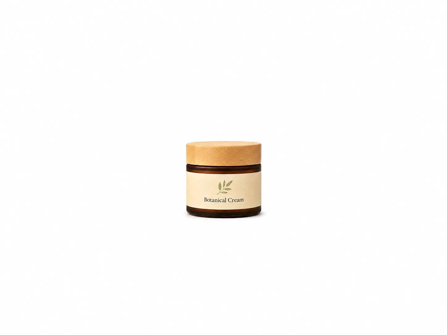
Tiny product
Too much empty space makes the item hard to inspect.

Glare
Reflections on plastic, foil, or glass can hide important details.

Low resolution
Blurry or compressed images reduce trust.

Added graphics
Main images should not look like banner ads.
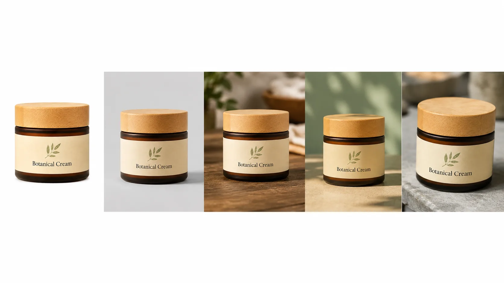
Inconsistent catalog
Products from the same brand should feel visually related. When each photo uses a different background, size, and angle, the catalog looks disorganized and less trustworthy.
Fix the biggest issue first
If you only have time for one improvement, fix the background and lighting. Those two changes usually create the biggest quality jump.
How to take a better photo before using RenderLift
RenderLift works best when the source photo clearly shows the product.
A better upload gives you a better result
You do not need a professional studio, but you do need a clear view of the product. The goal is to give RenderLift enough real detail to preserve.
Before you upload
Clean the product.
Wipe dust, fingerprints, smudges, or loose packaging fibers.
Face the label forward.
If the label matters, make sure it is visible and not bent away from the camera.
Use soft light.
Avoid direct flash or harsh overhead light.
Avoid extreme angles.
A slight angle is fine, but marketplace product photos usually need a clear, understandable view.
Take more than one shot.
Upload the clearest one. A small glare change can make a big difference.
Quick do / don't
Do
- Use a clean table or plain surface.
- Keep the camera steady.
- Shoot at the product's height.
- Check that the product is fully visible.
Don't
- Use screenshots from social media.
- Upload blurry photos.
- Shoot through plastic glare if avoidable.
- Cut off corners, caps, handles, or labels.
Use Marketplace Ready for Shopify product grids
Marketplace Ready helps create clean, centered product images that work well in Shopify product pages and collection grids.
A clean product image is the foundation
Even if your Shopify brand uses lifestyle visuals, every product should still have a clean, clear image that shows the item directly.
Use Marketplace Ready when
- You need clean product-page images.
- Your collection grid feels inconsistent.
- Your product backgrounds are cluttered.
- You want a clean ecommerce look.
- You need multiple products to feel visually related.
Shopify workflow
Upload the source product photo.
Start with the clearest image you have.
Choose Marketplace Ready.
Create a clean product-first ecommerce image.
Check the product details.
Review edges, label, color, and shape.
Use it in Shopify.
Add it to product pages, collection grids, and related product sections.
Create a clean Shopify product image
Use Marketplace Ready when you need a practical, clean storefront image.
Start with Marketplace ReadyUse Transparent for flexible Shopify design assets
Transparent cutouts help Shopify sellers place products into banners, ads, theme sections, and custom designs.
Transparent images are useful beyond the product page
A transparent PNG gives you a clean product cutout that can be placed on colored backgrounds, homepage sections, sale graphics, emails, and social posts.
Marketplace Ready vs. Transparent for Shopify
Marketplace Ready
- Clean product image
- Good for product pages
- Good for collection grids
- Best when you want a finished ecommerce photo
Transparent
- Product cutout
- Good for banners and ads
- Flexible for custom designs
- Best when you want to place the product into another layout
Transparent is not always the final image
A transparent cutout is a flexible asset. It may still need to be placed into a designed section or exported on the right background before use.
Need a product cutout?
Use Transparent when the product already looks good and you need the background removed.
View Transparent resourceUse Bulk for Shopify catalog updates
Bulk helps Shopify sellers update many product photos with a consistent approved look.
Shopify catalogs need consistency
When you add or refresh many products, the challenge is not just making one image look good. It is making the whole collection feel intentional.
Bulk helps with
Reference-locked consistency
Approve one look first, then apply that direction across the batch.
Review before download
Keep the images that work and try again on the ones that need another pass.
Download selected
Export only the approved images you choose.
Catalog updates
Useful for seasonal updates, new SKUs, supplier photo cleanup, and collection refreshes.
Bulk workflow for Shopify
Upload your product photos.
Add the images you want to process together.
Approve a reference look.
Make sure the style fits your Shopify storefront.
Review the batch grid.
Compare each result and keep the best images.
Export your selected set.
Download the images you want to upload to Shopify.
Refresh your Shopify catalog
Bulk is built for sellers who need many product photos cleaned up at once.
Learn about BulkShopify product photo checklist
Before uploading product images to Shopify, check these items.
- The product is sharp, clear, and easy to recognize.
- Main product images use a consistent crop and aspect ratio.
- Similar products feel like they belong to the same catalog.
- The product is not too small in collection thumbnails.
- The image still works on mobile.
- The background fits the product’s use: clean white, branded studio, lifestyle, or transparent.
- The file is high quality but not unnecessarily huge.
- The product title, variant, color, or packaging details are visible where needed.
- Secondary images show useful angles, scale, texture, or lifestyle context.
- Alt text is added in Shopify for accessibility and search context.
Downloads
FAQ
What size should Shopify product photos be?
Shopify says square product images around 2048 × 2048 px usually display best. Product and collection images can be uploaded up to 5000 × 5000 px or 25 MP, and must be under 20 MB.
Should Shopify product photos be square?
Square images are a safe choice for consistent product grids, but some themes support portrait or landscape ratios. The most important thing is consistency across similar products.
Should Shopify images have a white background?
White backgrounds are useful for clean product grids, but Shopify stores can also use branded studio backgrounds, lifestyle scenes, transparent cutouts, and hero images depending on the brand and page section.
Can I use lifestyle images on Shopify?
Yes. Lifestyle images are useful as secondary product media, homepage sections, collection banners, ads, and brand storytelling. Use clear product-only images first, then add lifestyle context.
Does Shopify compress or optimize images?
Shopify’s image system can deliver optimized image formats such as WebP or AVIF depending on browser support, but sellers should still upload clean, properly sized source images.
How does RenderLift help with Shopify catalogs?
RenderLift can help create consistent product images, clean backgrounds, transparent cutouts, lifestyle-style visuals, and bulk catalog updates.
Related resources

Amazon Product Photo Guide
Learn how to prepare Amazon product photos with clean backgrounds, strong lighting, proper sizing, and marketplace-ready presentation.
Read guide →
Marketplace Ready Template Guide
Learn when to use RenderLift Marketplace Ready, how to prepare your source photo, what to review before downloading, and how to use it for Amazon, Shopify, Etsy, Walmart, eBay, and other ecommerce listings.
Read guide →
Transparent Background Guide
Learn when to use RenderLift Transparent, when to choose Just Transparent vs Transparent + Lift, how to prepare source photos, and where transparent product images work best.
Read guide →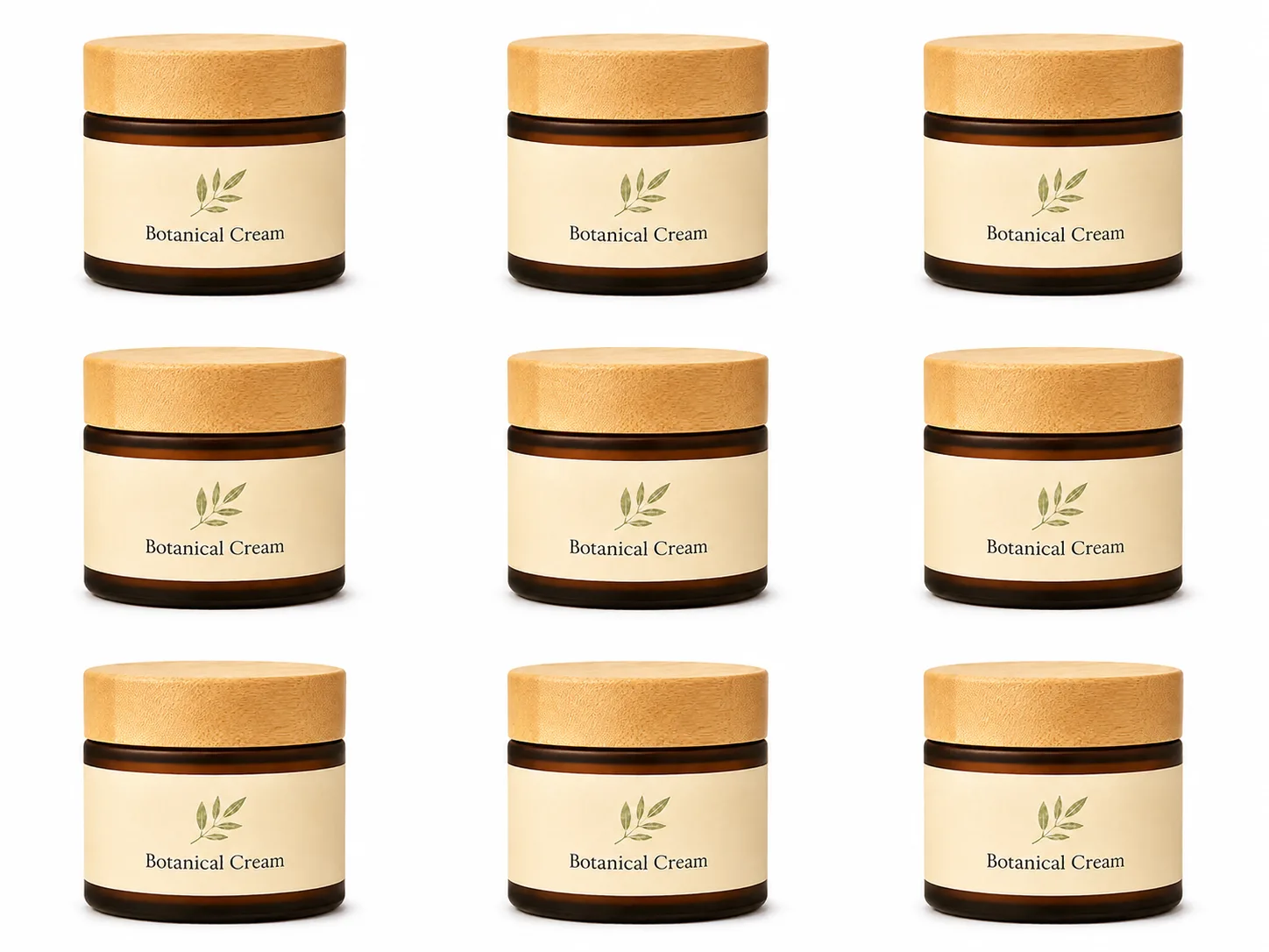
Bulk Product Photo Workflow
Learn how RenderLift Bulk helps sellers clean up 5–50 product photos at a time with reference-locked consistency, review controls, Try again, Lift previews, and selected downloads.
Read guide →
How Lifts Work
Learn how RenderLift Lifts work, how many Lifts common product photo workflows use, what happens with Try again, downloads, Bulk batches, Transparent outputs, and technical issues.
Read guide →Make your Shopify product photos feel consistent.
Upload a product photo, choose the right RenderLift template, review the result, and build a cleaner storefront image set.
Shopify image limits and recommendations may change. Sellers should review current Shopify documentation and their theme behavior before publishing.